I run a myriad of WordPress blogs. On most of them, I utilize a commenting system called Disqus. It’s just cool. There’s one thing that I was troubled by when I first implemented it. When enabled, the comment section seemed to be aligned flush with the width of my content, leaving no aesthetic margin to delineate a separation in design. Thankfully, using Firebug, I was able to inspect the Disqus comment area to find the class identifier so I could modify the design slightly to fit my site.
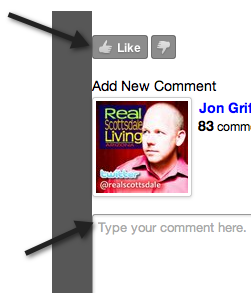
Notice the following image. The dark gray background and the Disqus comment area butt up against each other. Not cool. The right side of the comment form (not shown) also squished against the right hand side-bar. Not attractive at all.

Simple Fix
There’s a very easy CSS style that you can apply to your Disqus settings for a given website and you do it from the Disqus website:
- Simply login, choose the site profile that you need to address.
- Click the settings tab, then click Appearance on the left.
- Scroll to the bottom of the page and paste the following into the Custom CSS box:#disqus_thread { margin: 0px 20px 0px 20px; }
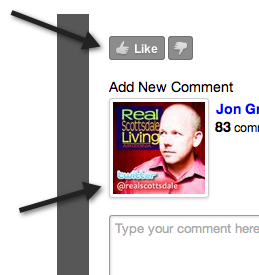
Save your settings, and re-load your blog. The setting above essentially squeezes the entire Disqus comment section by 20 pixels on the left and the right sides. You can modify this to suit your needs, but it should help you line up your comment box with the other content on your site.
Here’s how it looks now:

Hope that helps.